obr_data <- mutate(obr_data,
time = (year - 2008) * 4 + quarter)Appendix F — Exercise 8 solution
F.1 Question
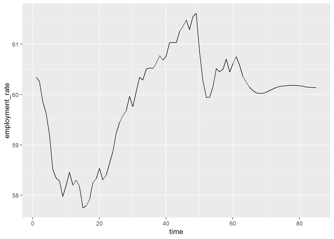
Choose an appropriate visualisation to investigate the change in employment rate between 2008 and 2024. Generate this visualisation and comment on your findings.
Solution
A line graph would generally be the most appropriate visualisation to show a numeric variable over time. The visual marking on the graph would be a line, defined by time on the x-axis and employment rate on the y-axis.
To create this line graph, we must ensure that all information needed is included in the data. In this case, we will need to create a new time variable, beginning at 1, that combines year and quarter to make up the x-axis:
To build the line graph, we first use the ggplot function and specify the data that we wish to display on the coordinate system. We then use the geom_line function to visualise the data, specifying the variables thatdefine this visualisation:
# Generate the chart area and specify the data
ggplot(data = obr_data) +
  # Add a line, defined by time on the x-axis, and employment rate on the y
  geom_line(aes(x = time, y = employment_rate))